
Well it’s been quite a while since I posted something, the reasons for which will constitute another post soon. Basically, the better part of the past year involved struggling through the uncertain, difficult precarity that is the academic job market while finishing the bulk of my dissertation. Anyone interested in the music theory job market in general should check out Prof. Megan Lavengood’s excellent post on her own experience with some nice overall stats, and Kris Shaffer’s post from a couple years ago. My experience in short: I was lucky, thankful, and extremely relieved to receive a 2-year visiting position after a grueling process that lasted from August until late April. I worry the market will be even worse during the next go around. Such is life in the academic rat race.
This post, though, is a brief summary of a side project I undertook smack in the middle of the job market process back in February. This exercise was basically a way for me to learn some new Python data management and graphing stuff, and was initially meant as a fun thing to do (i.e., procrastinate) to practice some programming. Essentially, I wanted to build a database of all songs to appear on the weekly Billboard Hot-100 charts, which I could then use to search for correlations or trends between genre tags, intertextual connections, or acoustic phenomena. I didn’t do much besides make some figures that track trends, but I’m hoping this can serve as the basis for a larger project.Since then, I’ve noticed a few blog posts, academic articles, and “news” stories that make use of datasets constructed using Spotify’s (née Echo Nest’s) acoustic parameters along with some Billboard Chart data. These studies all basically look at how popular songs compare to each other synchronically and/or diachronically, posing questions like, “has pop music gotten faster since the 1960s?” or “has popular music become more homogeneous?” Since I did a similar thing, I figured I’d write a post about my project and will give a few concluding thoughts about what it means to use mysterious “acoustic features” to make objective claims about music.
Process
The first thing I did was to create a database of all songs to appear on the weekly Billboard Hot100 since Jan 1, 1962. I used Allen Guo’s unofficial Python API for accessing data in the charts (https://github.com/guoguo12/billboard-charts). This took a bit to figure out and to run, but I eventually collected a solid dataset that contains all top-100 songs for about 2900 weeks. A few weeks do not appear in my collection since they have incorrect listings on Billboard’s website: some didn’t have any entry for a given place on the charts, others had duplicate entries. Since I was just interested in a rough and ready dataset, I simply removed any weeks that had anomalies. The resulting .csv basically has an index column, a date column, and columns for each spot in the chart, 1-100. Each cell that contains a song has its [‘Title’, ‘Artist’, prior week’s ranking, highest ranking, total weeks on chart]. This info is all publicly available on Billboard’s website (e.g., here).
The next step was to get all Spotify’s acoustic features for each song in its collection, of which it had about 96.5% of the ~21,200 songs to appear on these charts. For the remaining 753, I plugged in average numbers for each acoustic feature, just to have some placeholder data. I then put all those acoustic metadata back into the full Billboard list. So each row is a weekly chart, each column is a place on the chart, and each cell contains a song’s chart info as well as its acoustic features.
So, for example, a typical cell looks like this:
[‘Diamonds’, ‘Rihanna’, 2, 1, 8, 0.15, 0.721, 266147, 0.93, ‘3Oa9AekIq67UBax1H9bXp6’, 0, 5, 0.0943, -4.734, 1, 0.0389, 131.607, 4, 0.815]
with each comma-separated-value:
[0:song name, 1:artist, 2:last pos, 3: high pos, 4: weeks on chart, 5:acousticness, 6:danceability, 7:duration_ms, 8:energy, 9:id, 10:instrumentalness, 11:key, 12:liveness, 13:loudness, 14:mode, 15:speechniess, 16:tempo, 17:time_signature, 18:valence]
[0:4] are from billboard.py, and [5:18] are from the Spotify API. So basically, then, after that I just graphed the (rolling) median/means for each parameter to look for some trends. I took annual median values, which I realize leaves out fuzzier and richer weekly information, but I felt yearly averages were good enough for looking at broad diachronic spans. I might go back and see if there are any seasonal/monthly ebbs/flows to any of these parameters.
Some Figures
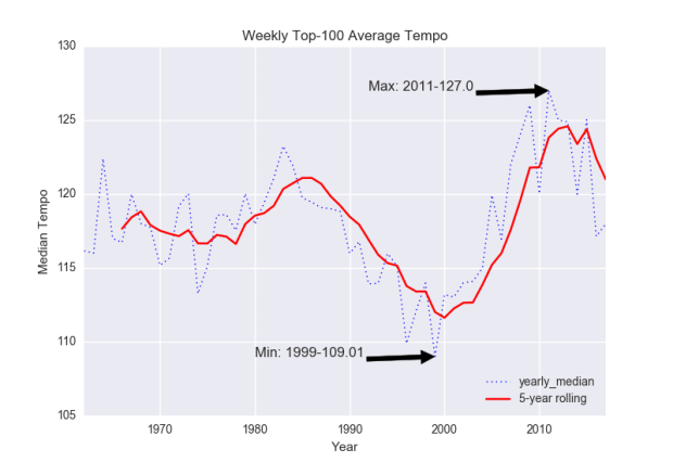
Fig. 1: Tempo.
Figure 1 shows some summary tempo information. The sharp decrease in tempo lines up with pop’s turn towards “chill” while perhaps hinting at an attenuation of the influence of the attention economy on the median hot-100 song. Spotify’s ecosystem in particular is geared towards creating soundtracks for everyday activities, meaning you probably don’t want a track to stick out too much or else it’ll get skipped. Or maybe late-00’s high-tempo EDM-infused pop started to seem an odd backdrop to the continuing economic uncertainty and division of the ’10s.
(At some point I’d like to engage the issues in Echonest’s tempo MIR algorithms, which often find strange tactus levels. Here’s an earlier project with scripts for finding tempo using Spotify’s API.)
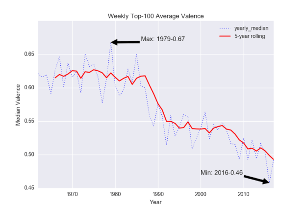
Fig. 2: Valence.
According to Figure 2, the average hot-100 song used to be much happier if we believe Spotify’s “valence” algorithms. Something like Barbra Streisand’s “The Main Event/Fight” (1979) embodies a roughly average “valence” (0.684) of the apparent happiest year in popular music, while “This Is What You Came For” (2016) by Calvin Harris Feat. Rihanna clocks in at about the average valence (0.465) for the saddest year.
-
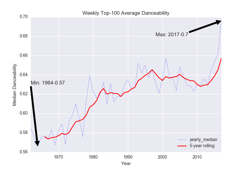
- Fig. 3: Danceability
-
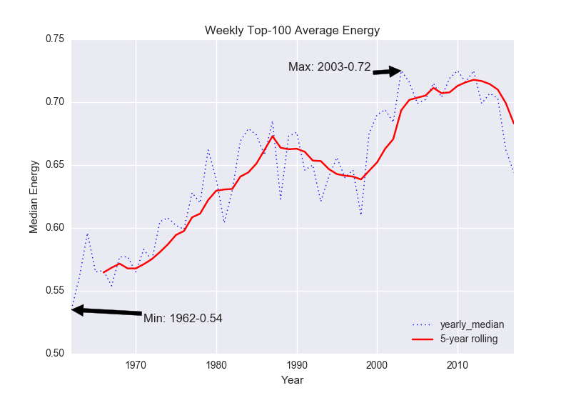
- Fig. 4: Energy
Despite being ostensibly sadder, pop music has gotten more “danceable” (Figure 3) and it only recently left a plateau of maximum “energy” (Figure 4).
-
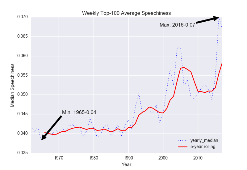
- Fig. 5: Speechiness
-
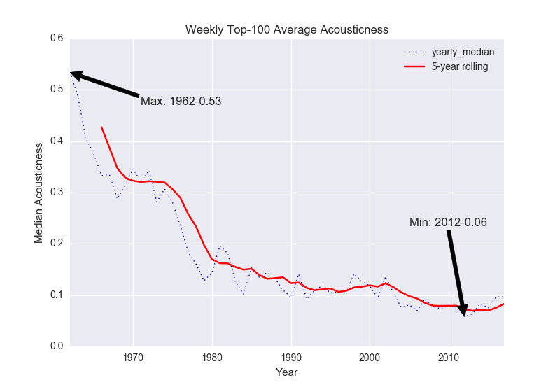
- Fig. 6: Acousticness
With the rise of hip hop in the ’90s and ’00s, popular music exhibits more “speechiness” than it had before (Figure 5), while the increased roles of electr(on)ic instruments, DAWs, producers, etc. have led to a steady decline in “acousticness” (Figure 6).
Some other charts without comment, except to note the frequent difficulty in determining the “key” or “mode” of some pop songs, as evidenced by the many conference talks and articles about the issue (e.g., this year’s SMT panel on “Tonal Multiplicity in Popular Music”):


Thoughts
Overall this was a very useful project for learning how to deal with large .csv files in Python, revisiting how to use pandas dataframes, pickling, the basics of matplotlib, and just dealing with data in general. There are still some big issues with the dataset. First, as mentioned above, some weeks are missing due to inconsistencies in Billboard’s online repository. Second, while collecting song metadata from Spotify, I took the first result of each API query, so same-titled songs/covers/versions will all have the metadata of whichever popped up first. So, for example, any cell in my database with Bram Tchaikovsky’s mildly successful “Girl of my Dreams” (1979) actually carries the metadata for Brandon Heath‘s song (2014) of the same name. There are a few random seeming mixups along these lines too. So, I’m not sure exactly how to fix this except on an ad hoc basis, but I’d need to get a more reliable way of searching before distributing the dataset. Also, I’ll be trying to incorporate the genre information for each artist in here, but with all the “Featuring” and “Feat.” and “&” connectors, I haven’t found an easy way of separating out all musicians involved in each track. Ideally, this would allow me to make a genre-weighted set of stats for these parameters, which might reveal a bit about how they’re skewed towards certain kinds of music (e.g., does r&b get assigned a lower valence on average than indie pop?).
But one thing this project wasn’t very useful for was figuring out what any of the trends in these various features might mean, if they’re spurious, how they’re influenced by the modes of measurement/classification that generates them, how they interact with success, what they tell us about experiences of top-100 hits, or basically anything interesting beyond somewhat banal statements of statistical change. And that’s kind of the issue. Some future projects will aim towards understanding the ways that MIR algorithms, like Echonest’s “acoustic features,” get treated as objective facts like they seem to be in the articles mentioned at the beginning of this essay. Since they are easily accessible and relatively complete, these features are no doubt attractive for doing studies on musical similarity and trends. But we should keep in mind that they still reflect particular decisions made by those involved in creating them, and lots of work on the feedback loops between actors and algorithms shows how seemingly objective measures/metrics/results generally carry inbuilt bias. (Some researchers are actively involved in providing “fair” classifications in machine learning situations.)
This is obvious, but it bears repetition. The field of music theory has been dealing this kind of issue for awhile: the “music itself” (what the acoustic features intend to measure) is a totally complicated, not at all clear concept, either ontologically and epistemologically. As Aaron Harcus has argued, “there is no such thing as a neutral description of a physical trace because any act of description, especially of the cultural phenomena that are the proper concern of semiotics, is always already an interpretive act … made possible by the analyst’s cultural-historical relation to the object in question” (2017, 35). Harcus turns to Merleu-Ponty to show how “objective” analysis is epiphenomenal and ultimately an impossible perspectiveless position. There is no such thing as a perspectiveless perspective, and Echonest’s acoustic features stem from specific perspetives. As they note in their discussion of how valence is determined, “We have a music expert classify some sample songs by valence, then use machine-learning to extend those rules to all of the rest of the music in the world, fine tuning as we go.” The training data reflects the perspective of “a music expert” (or of an audience subset), and the rest of Spotify’s catalog is categorized from their position.
So take the little figures above with some large grains of salt. Like most data analysis, they reflect an imperfect database with plenty of inbuilt subjective assumptions.
If anyone’s interested in my horribly messy code or .csv files, drop me a line and I’d be happy to share, with the caveat that everything is rather unpolished.
